

Local Newspaper
Croydon Weekly uses the main conventions that we would usually find real local newspapers that would be considered essential.
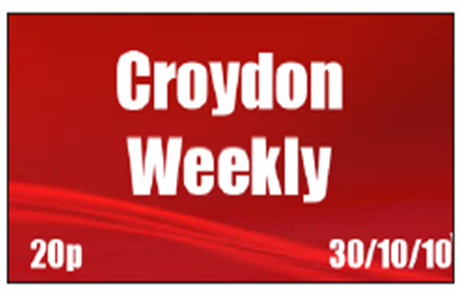
1. Masthead
The masthead is an essential convention to newspapers as it is important for the audience to identify the newspaper. I used the font 'Impact' on a red background. I used the font of impact due to the boldness it carries and in addition I used a red background to capture the audiences attention. My masthead was created with a wave through the background as I felt this offered a contemporary feel to the newspaper. In comparison to South London Press their masthead also uses a brighter background with the use of a bold text.
I also feel that my masthead developed conventions as it has a red wave through the background and conventionally newspapers who tend to use a colored background would use a still colored background.

2. Images
I also followed newspaper conventions by using a range of images throughout the newspaper which represent different things. For example my sports story photo shows the delight of a local teenager who has accomplished his dream and has a feel good feel for the audience. He is photo'd holding an Arsenal shirt at Arsenals stadium.
For my main headline photo , there is a photo of a house that has been burnt down. I used this photo to show the audience the remains of the house, and the tragedy that had taken place. Similar photos could be found in both Croydon Guardian and Croydon Advertiser when taking the image of a scene. The concept of this photo fit in well with my newspaper as it informs the audience of a loss to the community.
•My media product uses numerous conventions that best-selling newspapers would usually use. I did this by using such things a headline in bold and underlined, an introductory paragraph, use of photos and a banner advertisement.
•I decided to use numerous pictures as my market research showed that on a front page they would like to see pictures instead of one picture and all text, this decision should be successful in enticing readers.
•Another convention which I followed was the use of the sports story in the top right hand corner, which shows readers that the headline sports story would be.
•I decided to input the inside section as I felt that if the newspaper introduced what was inside it would give the audience more of an insight into what to expect further into the newspaper.
Website


I followed the main conventions that would usually be found on a newspaper website and some from all websites in general which are shown above.
Poster
I followed the convention of having a focal point as poster usually need one in which i made mine the celebrity to automatically capture the readers attention. I used a black background as i felt that this would make the artist stand out and emphasise the fact that she was the focal point. In addition , my use of text i felt stood out more so the audeince can clearly see the text and the interview.


No comments:
Post a Comment